my blog

GNOME

Entries feed

Friday 5 December 2008

What are you doing on February 7-8 2009?

The answer is, of course, that you're going to Brussels for the FOSDEM. And as usual, GNOME will be there. Christophe took care of everything and we'll have a devroom (GNOME-only on Saturday, shared for cross-desktop talks on Sunday, as we did in the past few years) and a booth this year again! I created some wiki pages about the GNOME presence at FOSDEM a few minutes ago (yeah for copy & paste!), but I guess they need some more work.

I guess there will be a call for presentation so we can have an amazing week-end in the devroom, and you can already start thinking about stuff you can talk about there. Christophe will handle all that. While the devroom looks good, we have an issue with the booth right now: so far, we don't have an official organizer. It'd be really nice to have someone step up and take care of organizing the presence of volunteers on the booth and of making sure that we have all the necessary materials for the booth. That's not really a hard job, and it's really a nice and effective way to contribute to our community.

So if you want to help with the organization of the GNOME presence at FOSDEM, and especially for the booth, go read Christophe's announcement and contact him!

Update: of course, blogging past midnight is not good idea. It's not February 6-7, but 7-8 :-)

Monday 17 November 2008

Le mystère de CollabNet face à la GNOME Foundation

Je suis tombé sur cette page à propos du Lutèce d'Or remporté par la GNOME Foundation il y a quelques semaines. Et à l'époque, il y avait un petit je-ne-sais-quoi qui me chiffonnait. Un lecteur averti trouvera rapidement la phrase coupable de ce méfait :

CollabNet, le principal fournisseur de services de développement collaboratif de logiciels basés sur les principes de l'open source, aide à la mise en place de la Fondation GNOME.

Je restai quelques jours avec celle-ci dans un coin de ma tête, la tournant et la retournant dans tous les sens, en me demandant comment il était possible d'avoir quelque chose qui me semblait faux de manière flagrante dans un tel article. Puis je décidai de prendre une pipe, d'attraper une loupe, de jouer du violon, et finalement d'enquêter. Après avoir joué de mes talents sur un site de recherche extrêmement peu connu (en six lettres), je parvenai sur ce communiqué de presse, avec cette phrase placée innocemment au milieu d'autres phrases parfaitement innocentes :

Collab.Net, the leading provider of collaborative software development services based on open source principles, is helping to organize the GNOME Foundation.

Je découvrai rapidement qu'il existe un second communiqué de presse mentionnant Collab.Net. La phrase avait donc une origine valide ; l'enquête pouvait ainsi être enfin close, le mystère étant résolu.

Reste cependant une interrogation : ces deux communiqués de presse datant de 2000, à l'occasion de la création de la GNOME Foundation, comment une phrase datant de huit ans, qui n'est plus d'actualité a pu apparaitre dans cet article. Je crains que ce nouveau mystère reste irrésolu, et désormaus seules des hypothèses, telles qu'une écriture quelque peu trop rapide de l'article en question, peuvent être évoquées.

Tuesday 28 October 2008

Medical GNOME

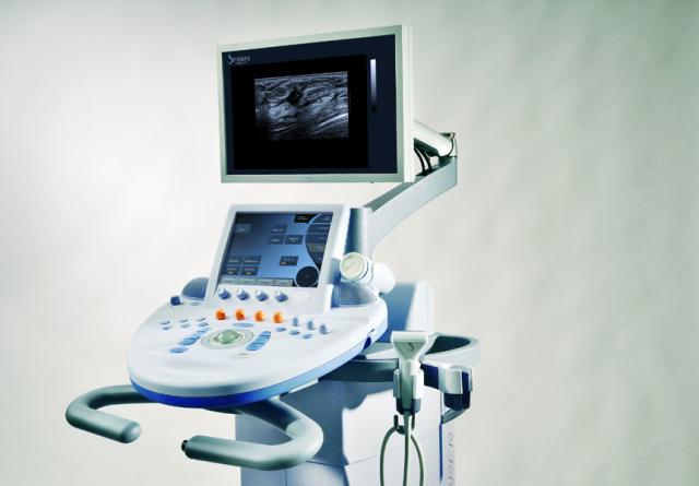
Some people might remember SuperSonic Imagine as one of the sponsors of GUADEC this year. If this is your case, I guess your reaction was but who are those people?, and what is their relationship with GNOME? Which is understandable, since they're working in the medical imaging field: that's not really where you expect GNOME to be, do you? If you read a bit about the company, you can easily find out that they are building a platform to measure and visualize tissue elasticity (I'm quoting from the website) and one of the application is breast cancer diagnosis.

It turns out SuperSonic Imagine has been building a product around this: it's a system called Aixplorer. Mmmh, I could try to give details about their product, but I would probably be caught just repeating what I can see on their website ;-) It contains some information about the product and the medical technologies it's based on, and there's also a brochure with some details. Anyway, back to the topic: there's quite some free software inside this system, including the usual suspects from the GNOME platform. It also looks like they're big fans of cairo, and they're using a compositing manager based on cairo. They're working on putting the relevant source code and patches up somewhere, but I guess most (all?) of the interesting stuff is already available, for people who don't want to wait.

Aixplorer

It's quite exciting to see free software used in such a field, and to think that it contributes to have an impact on the life of people we never thought of. Oh, and I heard that users can see the GNOME logo when the system boots. Extremely cool :-)

Wednesday 22 October 2008

Desktop Shell from the User Experience Hackfest: General Overview

It's probably time to start talking a bit more about what was discussed during the User Experience Hackfest that happened two weeks ago in Boston. I won't repeat what I previously wrote; a short summary was that it was wonderful :-) However, I'd like to get people thinking a bit about everything that was discussed: hopefully, others attendants will blog about various things, send mails, or even write code. Here's my contribution!

So, during the hackfest, I mainly took part to a group working on what can be called a proposal for an updated desktop shell. It's quite a big challenge to change a core part of the user interaction with the computer, but there's at least no harm in exploring various ways and in seeing if those make sense. So we tried to forget the current GNOME and see what we thought would make sense. In this post, I'll try to give a general overview and highlight the big items, but the wiki page probably has more details about all this, so it's worth a read (although you should not consider it as a complete specification; more work is needed!). Many thanks to Neil for working on the mockups, and of course to everybody who contributed to the current result (I'm not going to start naming people since I'll forget a few of them ;-)).

We started with a few observations (there were way more things than just those few items, but this should help you understand the rationale):

  • finding the window you want to find can be too difficult. Most people are using to the window list, but it takes quite some space and finding a window in this list needs focus from the user when you have more than 4 windows, eg.
  • workspaces are powerful but not intuitive. Power users use them, but it's just black voodoo for most users. It started being useful for normal people with the famous cube, though.
  • launching applications is too hard. The applications menu is just not well adapted for that: it takes a long time to find one item. Some people use launchers (but how do I add a launcher?), some use the run dialog, or GNOME Do, etc.
  • the current panel is okay-ish, but it's really not that great. You can have applets, but most people don't add applets (because they don't know how to add applets). You can move the panels on your desktop. You can even have a panel in the middle of the screen. Yeah. Useful.

I'm sure people will agree on some of those items, and disagree on others, but keep in mind that it's a short summary. For example, I could go on for a few hours on the topic of why the current panel is broken, if you're interested ;-) So, the conclusion was that we're quite good right now, but we could do better by changing things.

We played with a few ideas, proposed various things, stepped back, changed things again, etc. to reach the current mockups on the wiki page. I think there are a few core ideas behind this proposal, and here's an attempt to summarize them:

  • restrict ourselves to one static panel. Most people stay with the default panel configuration, and having two panels is eating a lot of screen space. Also, it's good to have something we can rely on: having two hot corners makes it possible to decide how we want to use those corners, and therefore it had an influence on the design of all this. One corner would be used to start the activities overlay mode (see below) and the other one would be used to control your presence on this computer (more details on this in a later post, I guess). Then we'd have status indicators for various things, like battery, network, weather, etc.
  • move applets out of this panel. Yes, we specifically try to avoid putting applets in there (although it can make sense to be able to add other status indicators, which I'd consider to be not applets). The current idea is to have a sidebar which would contain the useful stuff the user wants to have. We considered having a special mode like Dashboard, or desktop applets, but there were mixed feelings for this.
  • put forward the notion of activities. If you look at the current usage of workspaces, you can find out that most people use them to make it easy to switch between various mental contexts. And actually, nearly everybody using a computer has to switch between mental contexts, like read mail, browse the web, do my work, etc. The way we use workspaces, though, is static: you configure your desktop to have 8 workspaces; but it doesn't mean you use all of them right now. The goal here would be to focus on what the user is doing, on its activities. If the user wants to start a new activity which is different from what he was doing before, well, then let's make it easy to create this new activity. The goal is to have the computer adapt to the mental context of the user, and not vice versa.
  • having a special overlay mode for activities. This is probably the highest visible change here. This is where people control their activities: switching between activities, switching between windows in a activity, creating a new activity, launching a new application in a activity, opening a document, etc. Oh, did you notice the launching a new application part of the previous sentence? It's quite important: that means we can kill the applications menu (again, more details on this in a later post). To switch between activities or windows inside a given activities, we're thinking of using some Exposé-like effect: no need to think about the name of what you're looking for, but just visually find it. This overlay mode aims to be the place where the user goes when he stop focusing on a specific task and wants to do something else; a notable case is when the user logs in and wants to start using the computer. The fact that this mode would be a central place is what makes the notion of activities discoverable to the user.

I guess all this can sound a bit frightening, especially since you might think it breaks your habits as a user. But when you think hard about it, it's indeed different from what we have right now in various ways, but it also looks familiar. And hopefully, it looks more natural too. And that's the whole point: we don't want to break stuff because we like to break stuff, but because we think we can offer something better.

Okay, that's already a lot of information to digest (probably hard to digest, since I guess I'm not explaining all this that well...), and I didn't even go into details -- I actually skipped a few things (the notification center, eg). I'll try to write more details about some of those core ideas in the next few days, if nobody beats me to it. I'm convinced that we should start prototyping those ideas so we can play with them, and see what feels good and what feels wrong. It will need testing. We will make errors. And maybe it's a dead-end. But many people really liked this and I believe we reached consensus during the hackfest that we wanted to see this in action.

Oh, and since it doesn't make sense to have all this text without an image, here's a mockup of the overlay mode for activities, with the panel at the top (there's only one activity/workspace in this mockup, so it's probably not perfect to get the whole idea):
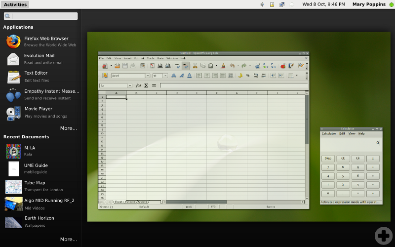
Overlay mode for activities

Friday 10 October 2008

News from the User Experience Hackfest

It turns out we've not been really effective in communicating what's going on in the User Experience Hackfest that's going on right now in Cambridge. It's kind of good and bad at the same time: bad, because it's important to keep everybody in the loop; good, because it means we've been quite good on focusing on work :-) So here's a short summary of things, and hopefully more will come (especially a few mockups/whiteboard pictures that people are working on right now).

First, a big thanks to everybody involved -- artists, designers, hackers: we have some good range of skills represented here. Also a big thanks to the companies involved, who accepted to let their people come and actually even pay for the travel and accomodation. We have people from Canonical, Imendio, Intel, Novell (who is also hosting the hackfest) and Red Hat here, which is quite awesome. That's quite an investment from those companies, and it's really cool to see them step up like that. Novell has also sponsored a dinner for all participants on Tuesday; it was funny to have a seafood-lovers table and a vegetarian+others table ;-)

On Monday, we started by discussing the current status of GNOME, where we're good at, where we're lacking, etc. We then started focusing on a few topics. Those topics turned out to be well adopted and that's mostly what we worked for most of the week; more details on them in a few sentences. On Tuesday, we had some great presentations from Dave Richards and OLPC people, and both were quite helpful in different ways: getting closer to our users, and thinking out of the box. They definitely had an impact on what we did afterwards.

So, since Wednesday, we're working on the three topics that emerged during the first day: desktop shell, access to documents, and adding effects/animation to the desktop experience. I won't detail everything here, but I think we've ended up with some good stuff:

  • effects/animation: this focused on adding the tiny touch that makes a difference for the user. This is actually quite useful to make things more understandable and intuitive for the user. People had some nice ideas there, some simple, sand sme less simple...
  • access to documents: broad topic here, and I wasn't there for most of the discussions. I think many people liked the OLPC journal (hrm, can't find a good link for that with screenshots), and there's some kind of will to at least hide the hierarchical directory structure. A time-based view of the documents, some tag-based search and various other approaches were discussed, I believe. As was adding more context to documents (at least according to the whiteboard I'm looking at right now ;-)) -- the typical example being this document was attached to a mail from Jane received on Tuesday. I didn't look at the mockups, but it all sounds good to me, and I hope that having some of the right people talking together here will help make this all happen.
  • desktop shell: this has been the topic I've been following. We started out by thinking about window management, workspaces, applets, sidebar and notifications. Many things :-) And we now have some good mockup which is quite different from what exists and also quite familiar -- probably because it makes a lot of sense (to me, at least). Some highlights are: making workspaces actually useful and discoverable for all users, fixing the way we find and launch applications, having a central piece of the shell in the form of a panel which makes it easy to access what's important, etc. It's quite hard to explain all that without the mockups, but we're re-doing them so they are in a publishable state ;-)

I guess it's quite hard to get a good feeling of all this right now, but once the wiki page will be a bit more filled, things should get clearer. We still have a few hours ahead of us, but I already feel like it was a good and productive week, with great results. And I'm getting really excited about what we'll do in the next 1-2 years!

- page 12 of 36 -

by Vincent